25 Trends in Publishing: TV Pilots
January 30, 2019Say Yes to Dress(ing up): Hope’s Hacks
March 5, 2019
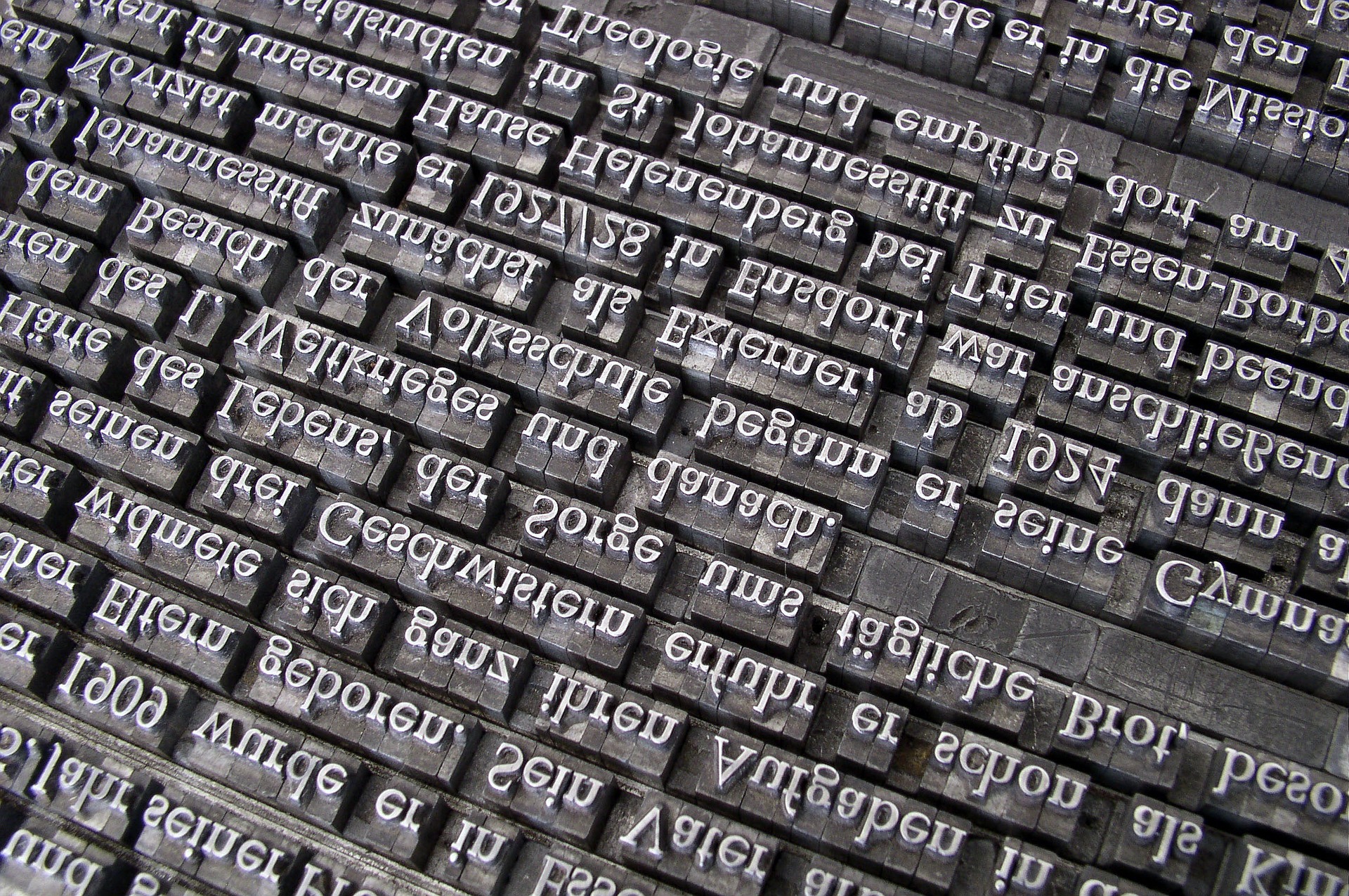
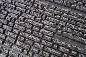 This month’s cure: Font Runner
What the cure is: Changing the font you use when you write.
Why the cure will help: A recent trend in changing one’s font has proven to increase productivity in writing, and well, it’s fun.*
Fantasy Font Suggestions: Algerian, Matura MT Script Capitals, Old English Text (if you can read it). Anything that screams Lord of the Rings or Medieval England.
Sci-Fi Font Suggestions: Magneto and AR Destine. Anything that gives the font a futuristic sort of feel.
Thriller Mystery Font Suggestions: Chiller and AR Darling. Something that screams . . . well, screams.
Romance Font Suggestions: Anything curly and flowery such as Curlz MT and most of the Lucida style fonts.
Children’s Book Font Suggestions: Jokerman and Goudy Stout. Operative words: silly and big.
MG/YA Font Suggestions: Depending on the subgenre: Alternate Gothic2, Berlin Sans FB Demi, SHTupo.
Other Genre Suggestions: Believe it or not, most writers suggest taking up Comic Sans. This ghastly font by all design standards actually is easier on the eyes because of its sans-serif nature. As a playwright, I’m also a personal fan of Broadway, but most would deem that font to be an acquired taste.
*Please change it back to Times New Roman, 12 pt. when you submit it to an agent or publisher.


 This month’s cure: Font Runner


8 Comments
I never thought to try that in my MS, but occasionally change it up on my blog. Cool suggestion. Love the disclaimer at the end. 😉
Thank you! And I had no idea this was such a trendy thing until recently, but it really works!
Very interesting. Thanks so much!
Absolutely! Thank you for giving it a read!
I’m partial to Papyrus and Bookman Old style… affirms me as a writer… something in the name is validating! It has been my experience that font can inspire creativity. I am also drawn to Berlin Sans FB which affirms my desire to write children’s books.
Oooh, all great fonts. Absolutely love Papyrus. Part of me wishes it could be the new Times New Roman.
So glad to read this! Fonts are fun and it’s easy to switch all of it back to good ol’ (snore) TNR.
So true. The same three fonts can blur together after a while, especially when it comes to editing.